3.2.4 Gets Responsive Facelift
You've heard the buzz, get responsive now. You have to be viewable on mobile devices and tablets. There are more phones than people on the planet. Reach that market with a site that adapts to screen size.
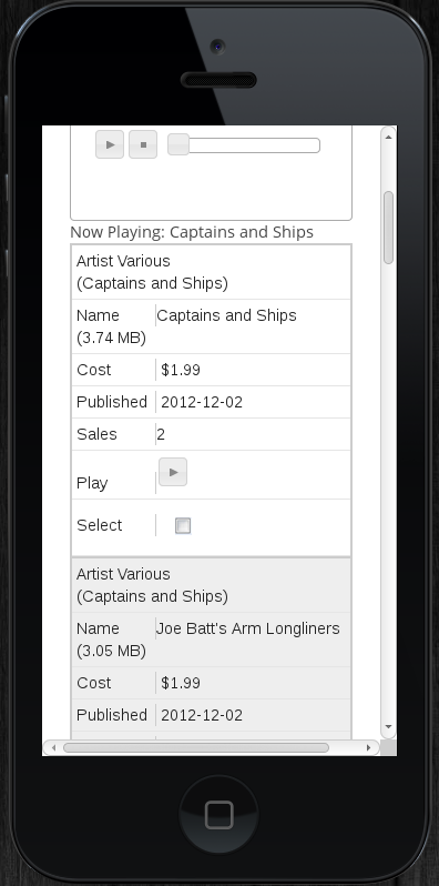
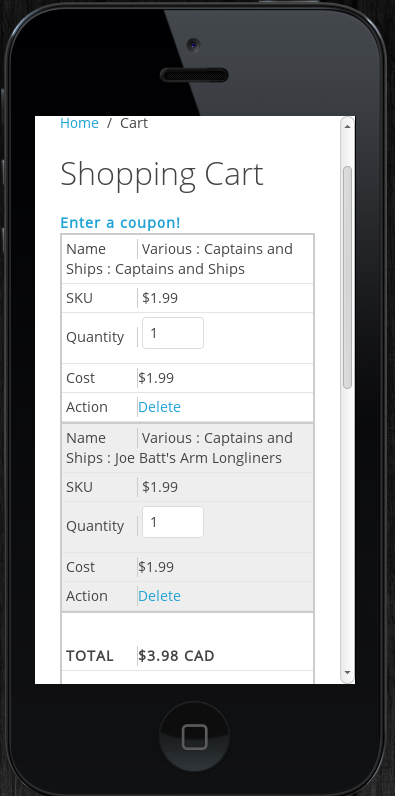
MyMuse gets responsive by turning tables of data (like your tacks) into zebra striped lists that can be scrolled on your mobile device. We have gone through all our views and shopping cart pages and applied special styles to all the table elements. Media queries in the CSS allow us to apply different styles depending on screen size. Read more to see some screen shots.
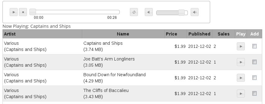
Here's a shot of the 'tracks' view.

And here it is on an iPhone5.
 |
 |
- Last updated on .
- Hits: 10764